
Ecommerce
ISDIN Redeem
ISDIN is a skincare company specializing in advanced dermatological solutions.
The Problem & Our Outcome
🔴 High friction in the redemption process. Users found it confusing, leading to a 50% drop-off rate before completion.
🎯 Reduced drop-off rate by 35%, by increasing user engagement, and boost successful redemptions. Through data-driven insights, usability testing, and iterative design.


Card Sorting

Fake door test

Moderate Testing
PHASE 2
Research & Findings
We synthesized data to drive actionable insights:
A user persona profile was created to represent our user.
Key insights from previous tests (card sorting, fake door, usability testing) were highlighted to pinpoint opportunities.
A service blueprint was developed to map the end-to-end experience, ensuring alignment between user needs and operational workflows. This step was crucial for refining the product strategy and delivering a seamless, user-centered solution.


We used Teresa Torres' Opportunity Solution Tree.
That helped us align efforts and make strategic decisions. We started with a clear goal (the trunk), identified key opportunities (the branches), and explored solutions (the leaves) to prioritize and move forward with the most promising ideas.
PHASE 3
Design
We transformed insights into tangible solutions through a structured design process:
Assumption Mapping helped us challenge existing hypotheses and uncover potential gaps in the user journey.
A Wireflow was developed to explore new interaction paths, ensuring a fluid and user-friendly experience before validation.
A new design proposal focused on concrete improvements, refining the Login flow and Product Detail Page (PDP) to boost usability and conversion.
Each iteration was guided by data, shaping design decisions that aligned with both user needs and business goals.


PHASE 4
Testing
I created an Experiment Kanban Board to visually track and prioritize hypotheses, ensuring we focus on the most impactful insights.

🚀 Optimizing Redemption Flow with A/B Testing
We ran 10+ A/B tests to refine the user journey. The two most important testing was:
1️⃣ Smoother Login/Register after QR scan – reducing drop-offs.
🔴 Option A: After scanning the QR code, users were immediately redirected to the Login/Register page.
✅ Option B (Winner): After scanning, users were taken directly to the product grid, allowing them to browse for 4 seconds before triggering a Login/Register modal.
This small change made a big impact—giving users a chance to test before committing, leading to higher engagement and more registrations. 🚀

🚀 Results:
✅ +18% increase in registrations
✅ 12% drop in bounce rate
💡 Key insight: Users engage more when they understand the value before committing. A “value-first, action-later” approach wins.
2️⃣ Faster PDP-to-redemption flow – boosting conversions.
🔴 Option A: Standard product detail page (PDP) with a traditional layout—product image, name, and description.
✅ Option B (Winner): Added a highlighted message at the top of the PDP with a creative, benefit-driven hook:
"The hack to skip the 20 takes and the 'soften' filter in your selfies."
This small but impactful change captured attention instantly, making the product benefits more relatable and engaging before users scrolled.

🚀 Results:
✅ +14.8% increase in add-to-cart rate
✅ +9.2% increase in conversions
✅ +17% increase in time spent on the PDP
💡 Key Insight: Users respond better to playful, real-life benefits rather than standard product descriptions.
Clear, simple changes. Big impact. 🔥
PHASE 5
Delivery
Bringing a product to life is like building a house. Every brick, every nail, and every blueprint matters.
You don’t just put up walls; You create a space that’s smooth, intuitive, and built to last. This phase wasn’t just about flipping the switch it, was about laying a rock-solid foundation for an easy, rewarding experience at ISDIN USA.
Every insight, test, and iteration shaped the foundation of this launch. Now, the final product isn’t just live, it’s thoughtfully designed to attract, engage, and reward customers with ease.
🎬 Watch the journey unfold.
PHASE 6
Post-Launch & Learnings
📊 Key Results: Turning Rewards into Action
A great loyalty program isn’t just about earning points—it’s about making them easy and exciting to use. After launch, we saw:
✔️ More redemptions (+37%) – Users engaged faster.
✔️ Higher conversions (+21%) – Points drove real purchases.
✔️ Fewer drop-offs (-12%) – A smoother, faster redemption flow.
💡Clear guidance made it easier for users to redeem points, leading to quicker actions and repeat purchases.
🗣️ User feedback: More than just numbers
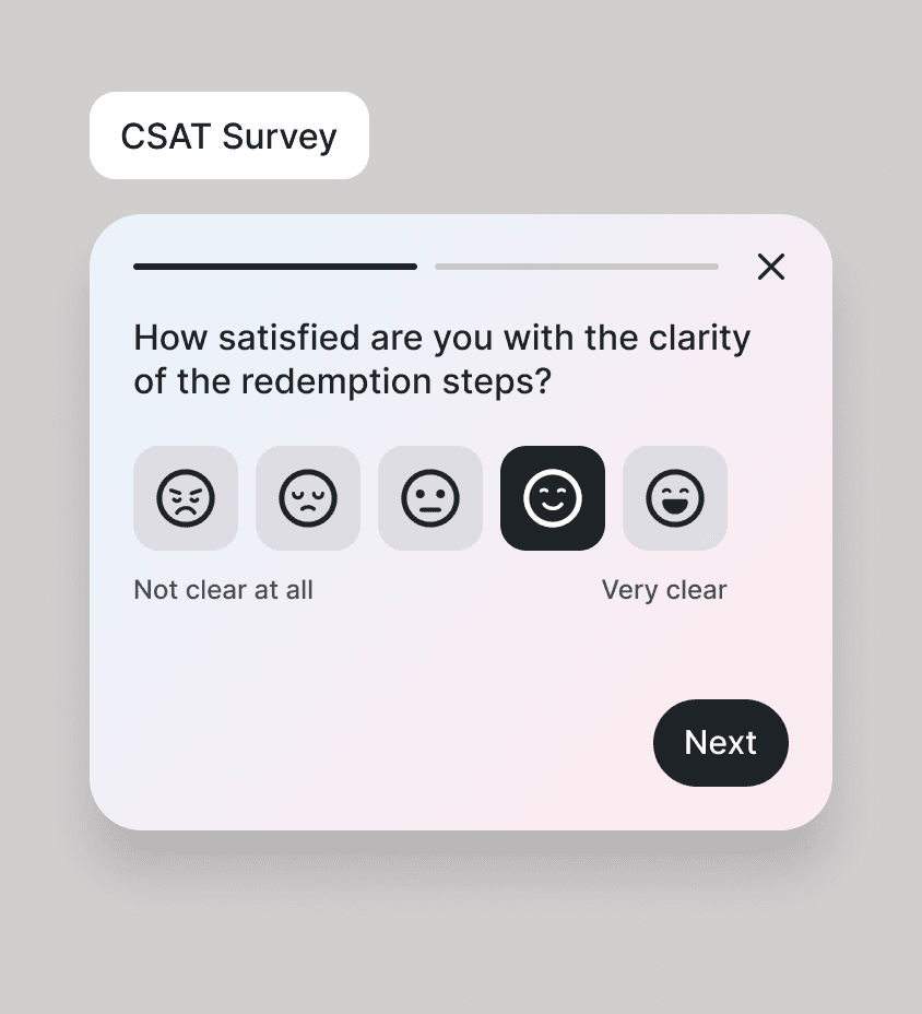
Surveys alone don’t solve problems—real improvements come from real user insights. We used CES and CSAT surveys to measure effort and satisfaction in the new redemption flow.
📊 CSAT Score: 88% – “Redeeming my points was fast and easy.”
📊 CES Score: 7.8/10 – “I expected more redemption options.”
💡 Metrics highlight friction, but open feedback reveals why.
When scores were low or negative, we introduced a follow-up text field, allowing users to share what felt unclear or frustrating. This gave us actionable insights to refine the experience based on real needs.

🎯 Key takeaways: what I’ve learned & what’s next
1️⃣ Small changes, big impact
It’s crazy how the tiniest tweak can completely shift results. A single microcopy change, a small layout adjustment, sometimes that’s all it takes. Always test, never assume.
2️⃣ Launch isn’t the finish line
Just because it’s live doesn’t mean it’s done. Keeping a culture of constant experimentation is key.
3️⃣ Users don’t always know what they need
People say what they think they want, but behavior tells a different story. Asking the right questions, digging deeper, and reading between the lines is the real deal.